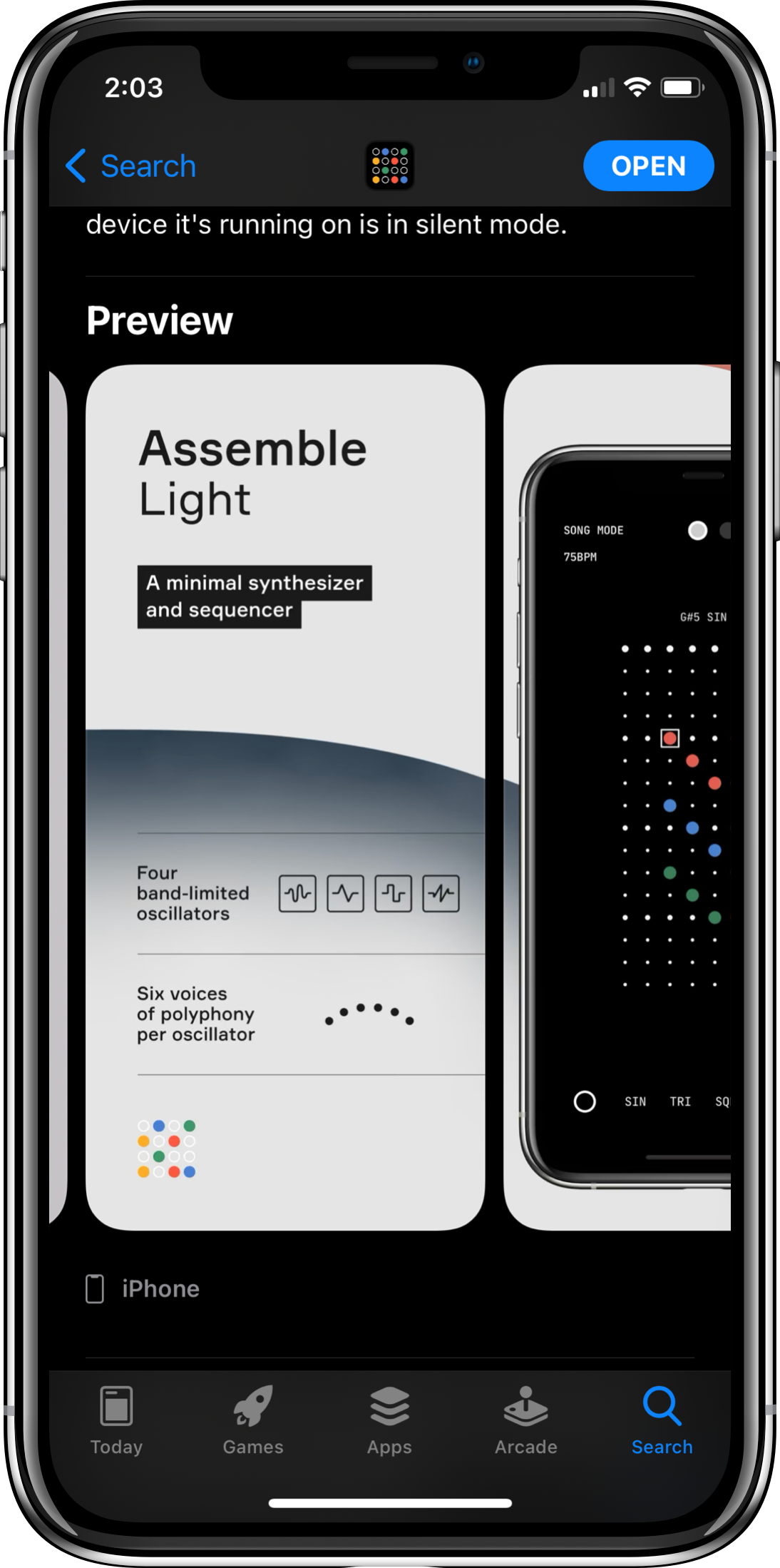
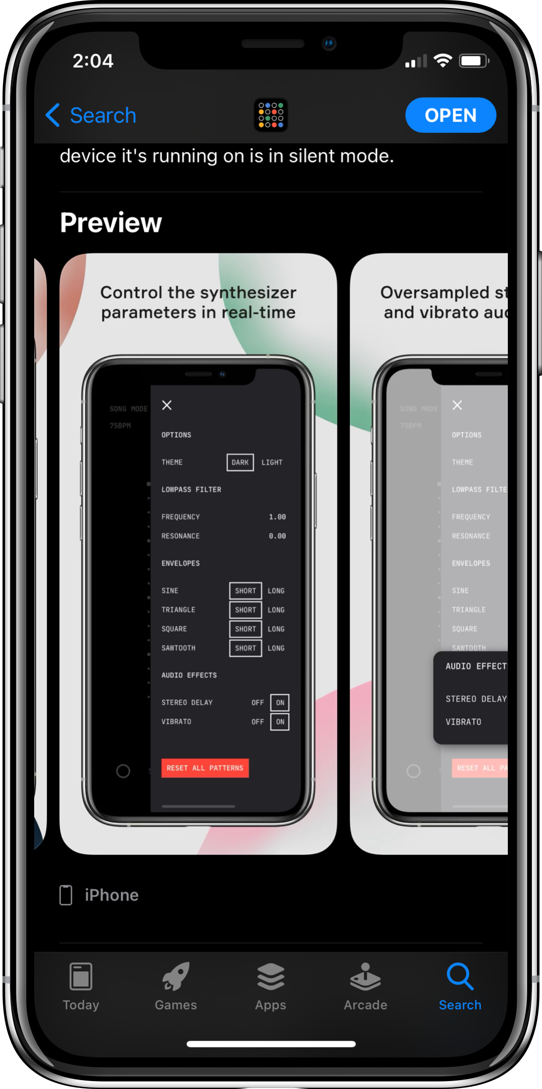
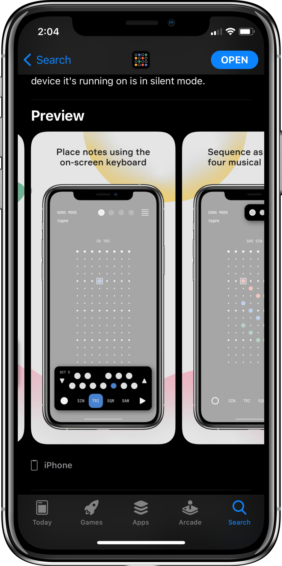
I had the pleasure of designing the branding and App Store screen designs for two synthesiser and sequencer apps: Assemble (iPadOS) and Assemble Light (iOS).
Both icon designs reference the app's musical grids and key functionality in the simple and minimal style that the user interface embodies. The App Store screenshots on the other hand use organic, three-dimensional graphics that contrast against the clean and minimal app designs. The orb-like shapes serve as an additional brand element that can be utilised throughout other promotional materials such as social media posts and video animations.
Assemble and Assemble Light are both available to download on the Apple App Store.


